

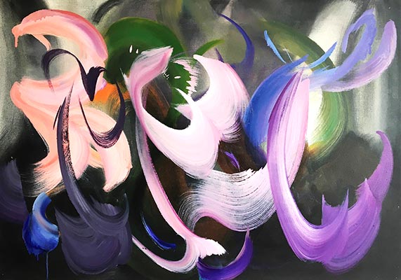
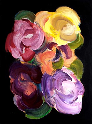
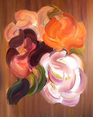

Allan Forsyth

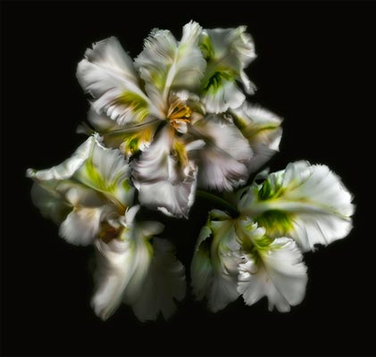
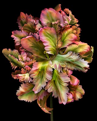
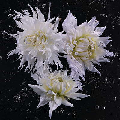
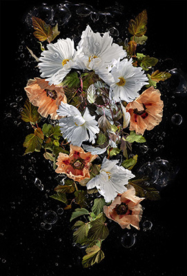
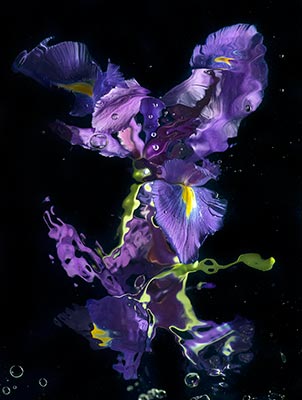
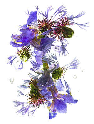
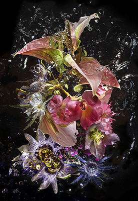
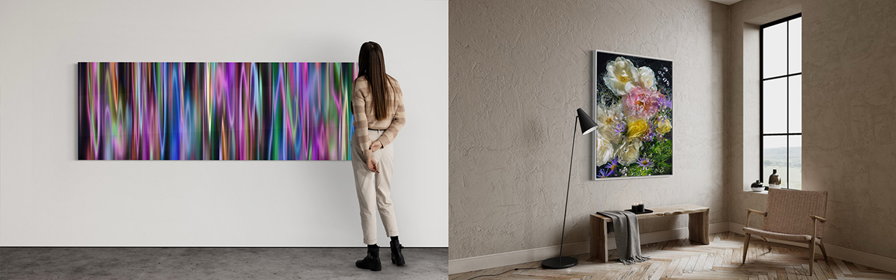
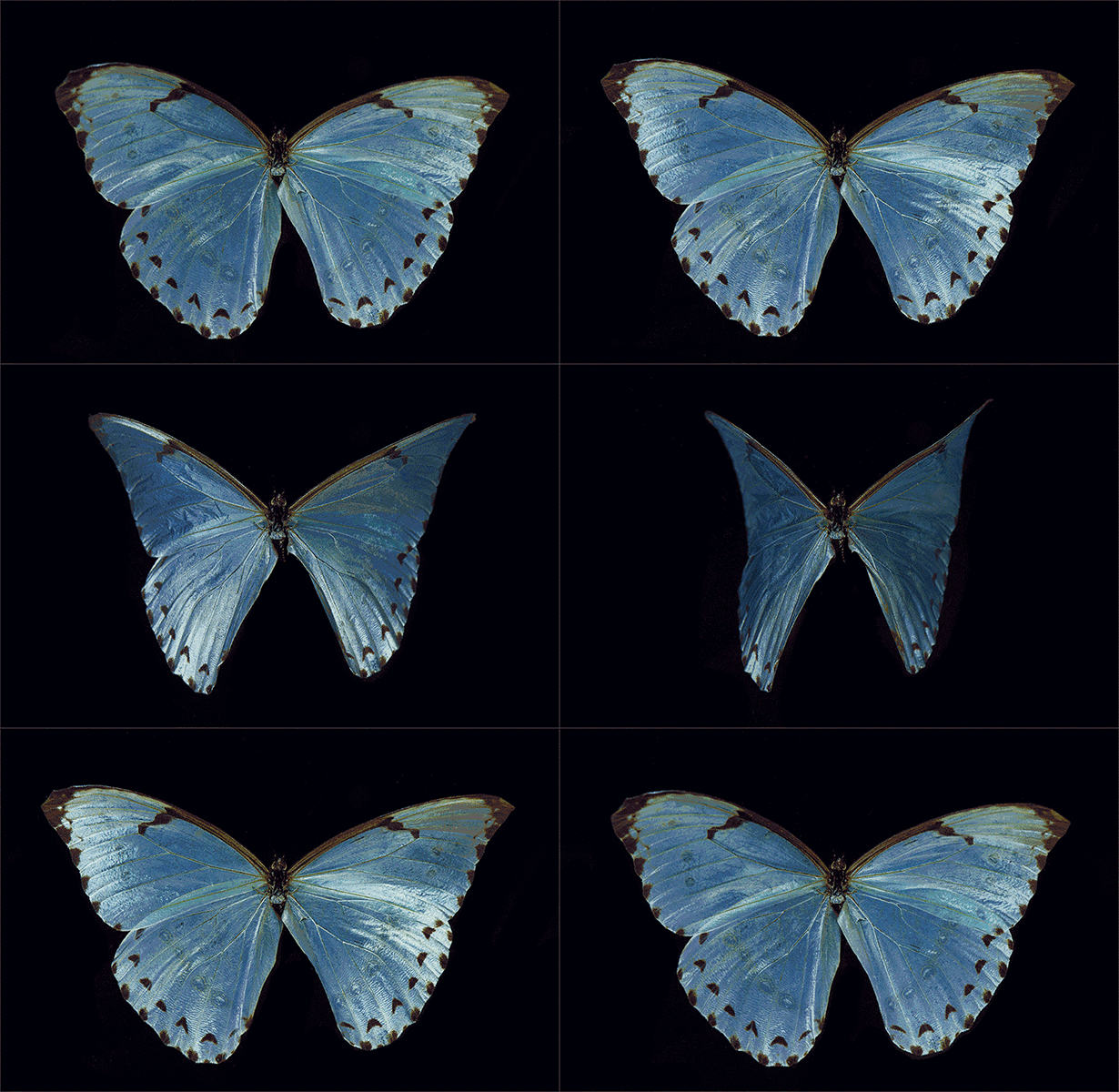
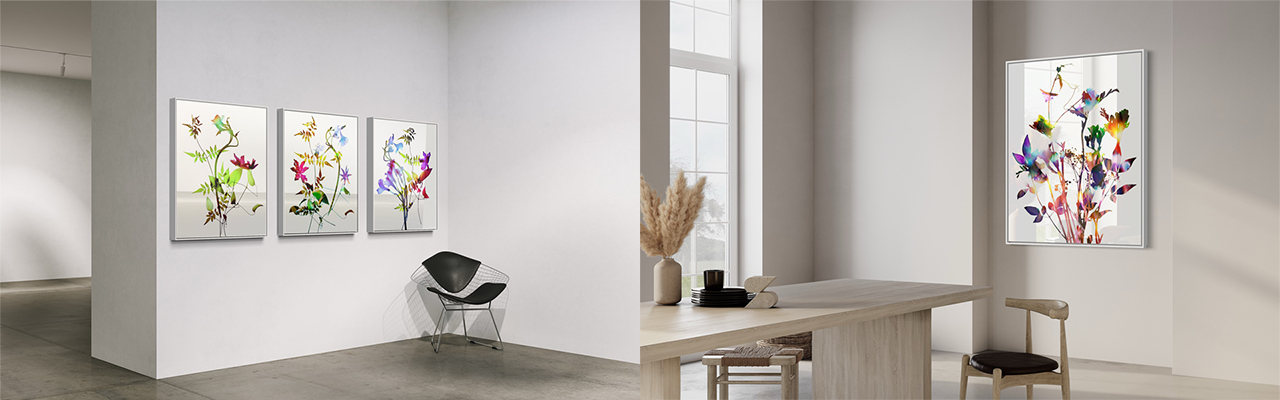
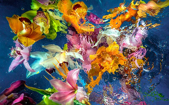
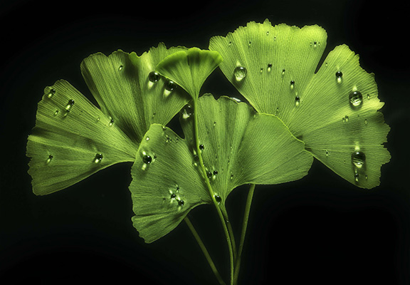
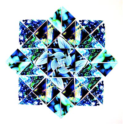
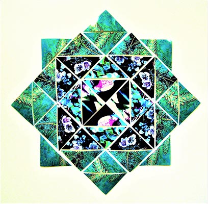
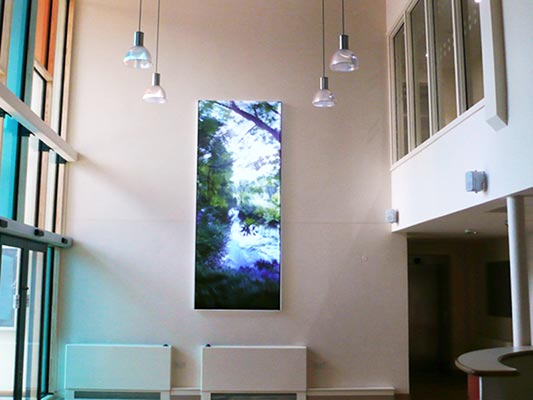
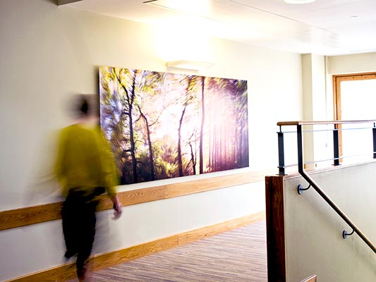
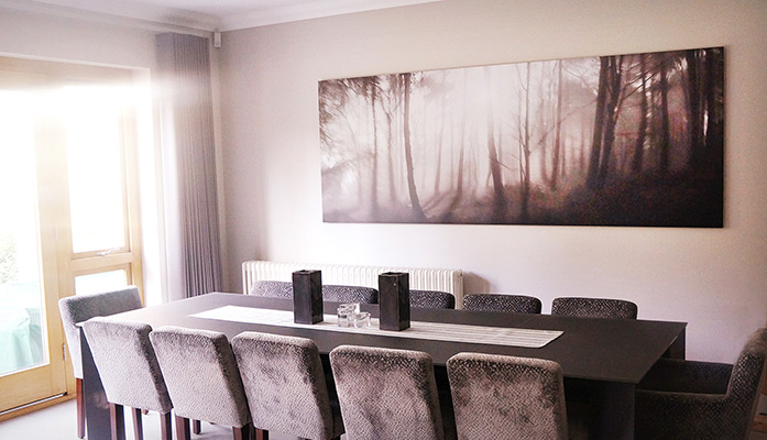
Nature is never quite still in Allan Forsyth’s world. Leaves shimmer, flowers appear to breathe, and fleeting moments unfold into immersive compositions that evolve with every glance. Working from his London studio, Forsyth creates richly layered artworks that blur the boundaries between photography, digital art, and experimental image-making, inviting viewers to experience the natural world through a renewed and heightened perspective.

Inspired by the intricate beauty and quiet drama of flora and fauna, Forsyth is drawn to the patterns, textures, and rhythms that often pass unnoticed. Rather than documenting nature as it appears, he transforms it, using colour, light, and movement to reveal hidden dimensions and evoke an emotional response. His work encourages a slower way of looking, celebrating both the complexity and fragility of the world around us.

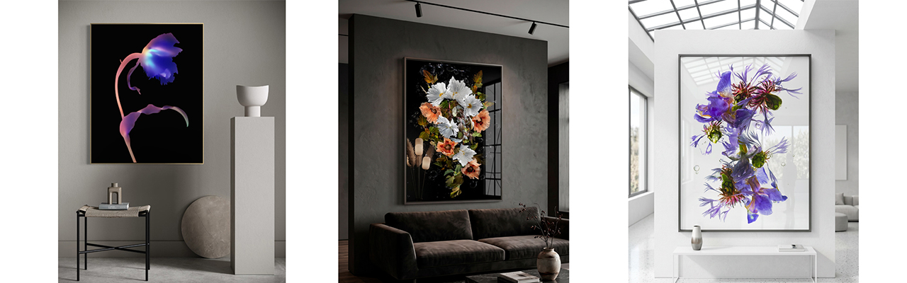
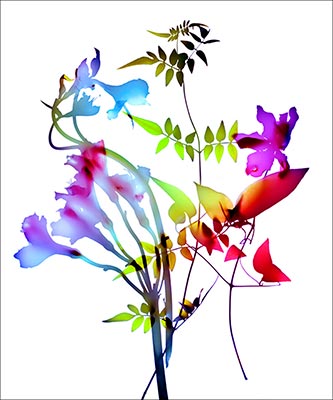
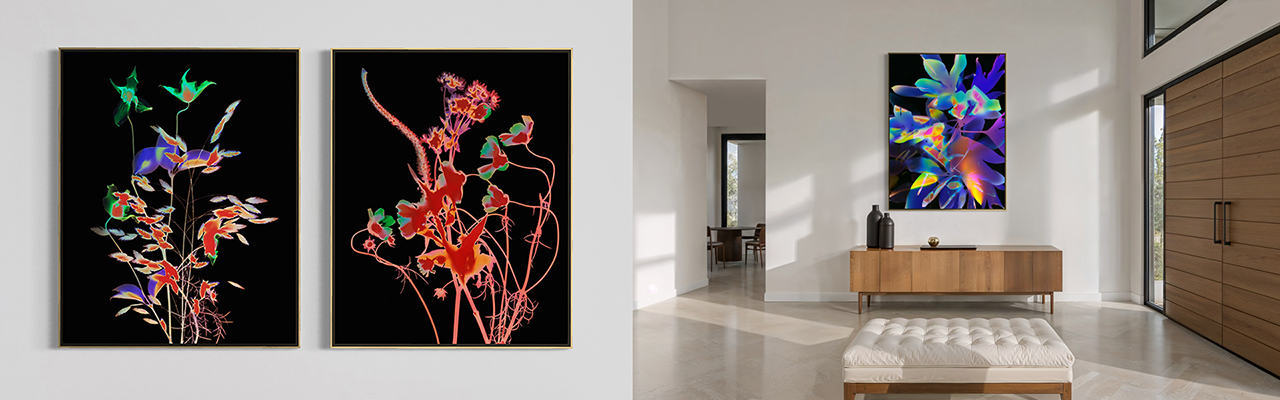
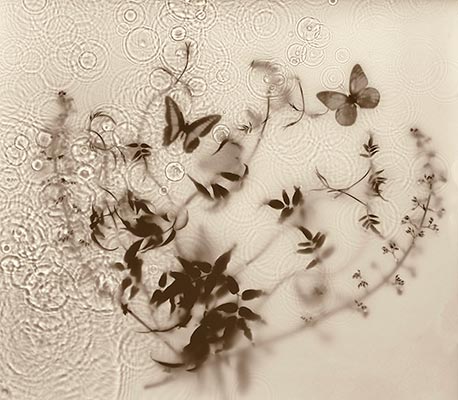
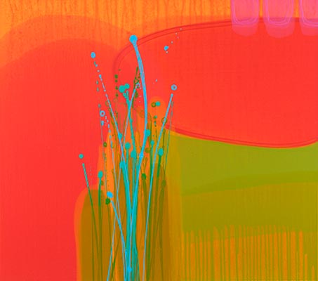
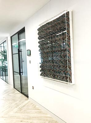
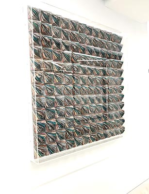
Employing an expansive visual language, Forsyth combines analogue and digital photography with photograms, collage, computer-generated imagery, and extensive digital manipulation. Each technique becomes another layer in the creative process, allowing him to construct images that feel simultaneously familiar and dreamlike. His lenticular works introduce yet another dimension, responding to the viewer’s movement as images shift, ripple, and subtly transform. These kinetic pieces create a sense of life and energy, capturing the fleeting, ever-changing qualities of nature in a medium that is constantly in motion.

Forsyth often describes himself as “an artist that uses photography” rather than a photographer, reflecting a practice that places creative expression above technical convention. For him, the camera is only one of many tools used to realise an idea. Whether working with Victorian-era photogram techniques or contemporary digital processes, he continually challenges the traditional boundaries of photography, producing artworks that are immersive, evocative, and instantly recognisable. The result is a body of work that celebrates both innovation and imagination, revealing the extraordinary beauty that exists just beyond our everyday perception.

Categories:

  • Photography

Mediums:

  • Photography
  • Photomontage
  • Photograms

Subject Matter:

  • Abstract
  • Animal/Botanical
  • Still Life
{"autoplay":"true","autoplay_speed":"3000","speed":"300","arrows":"true","dots":"true","rtl":"false"}

My work conveys my love of the drama of nature, seeking to expand the beauty of natural forms that we sometimes overlook in everyday life showing an extra dimension in his work.

Allan Forsyth

Enquire about

    We will only use your personal information to send you information which you have requested from us. However, from time to time we may contact you with details of other services we provide. If you consent to us contacting you for this purpose please tick to confirm.

    I consent

    View our Privacy Policy for information on how we store, protect and manage your submitted data.

    Kim Baker

    Kim Baker bases her work on nature and nature morte as a motif. She combines this with abstract expressionism and the materiality of paint. She uses the motifs of flora, forests and fauna whilst retaining a gestural and layering technique. Kim often paints over an existing painting which can give the works a sense of history and depth.

    Influences include Dutch 17th Century floral still life’s, the baroque painting of Murillo, the chiaroscuro of Caravaggio and American abstract expressionism of the 1950’s especially De Kooning.

    “Kim Baker’s striking oil paintings take inspiration from the memento mori tradition as it evolved in seventeenth century Dutch still life’s. Her canvases thus feature flowers, birds and insects, the traditional motifs of these earlier works, while retaining a spontaneous technique characteristic of more recent times. Baker often reworks her canvases repeatedly, painting one image on top of another until the finished work tells an additional story; that of its own genesis.”

    Nature Morte. Contemporary artists reinvigorate the Still Life tradition.
    Michael Petry
    Thames and Hudson.

    View Current Artworks

    Categories:

    • Paintings

    Mediums:

    • Paintings on Canvas

    Subject Matter:

    • Abstract
    • Animal/Botanical
    • Still Life
    {"autoplay":"true","autoplay_speed":"3000","speed":"300","arrows":"true","dots":"true","rtl":"false"}

    Kim Baker’s striking oil paintings take inspiration from the memento mori tradition as it evolved in seventeenth century Dutch still life's.

    Michael Petry - Thames and Hudson

    Enquire about

      We will only use your personal information to send you information which you have requested from us. However, from time to time we may contact you with details of other services we provide. If you consent to us contacting you for this purpose please tick to confirm.

      I consent

      View our Privacy Policy for information on how we store, protect and manage your submitted data.

      Mark Godwin

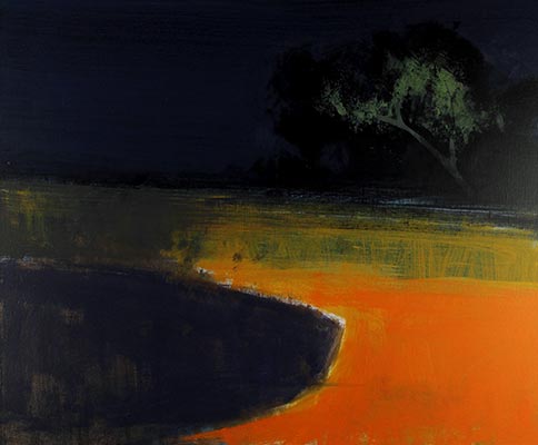
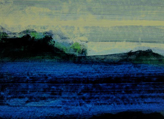
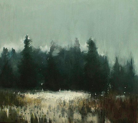
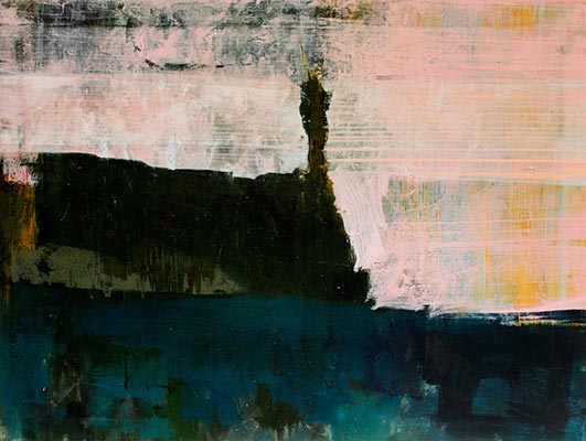
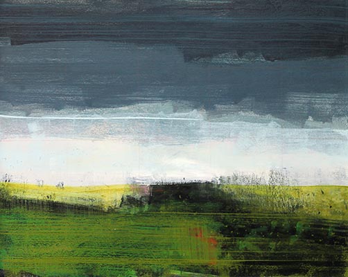
      The motif of Landscape has been a major part of the work of Mark Godwin for over 30 years. He has been greatly influenced by the 18th century Romantic notion of the Sublime, and our longing for an emotional encounter with nature.

      These paintings are about finding a visual equivalent for his sensation before nature. They are paintings about the poetic idea of landscape. There is a nostalgia, and timelessness about his work, and a conscious blurring of the boundaries between abstraction, and representation. They are landscape of the imagination. They are paintings about feelings.

      Mark Godwin began his artist training at Stourbridge College of Art and progressed on to Central School of Art, the Royal College of Art and Cite Internationale des Artistes in Paris. Following his training Mark went onto work as a copperplate printer for Palm Tree Editions, Albion Editions and London Contemporary Art.

      Since then Mark has set up his own studio to develop his practice concentrating on painting and printing. He has exhibited extensively and his work has been included in many collections both private and corporate.

      Categories:

      • Paintings
      • Prints

      Mediums:

      • Painitngs on Canvas
      • Paintings on Paper
      • Screen Prints
      • Etchings

      Subject Matter:

      • Abstract
      • Landscape
      • Cityscape
      • Seascape
      {"autoplay":"true","autoplay_speed":"3000","speed":"300","arrows":"true","dots":"true","rtl":"false"}

      These paintings are about finding a visual equivalent for my sensation before nature.

      Mark Godwin

      Enquire about

        We will only use your personal information to send you information which you have requested from us. However, from time to time we may contact you with details of other services we provide. If you consent to us contacting you for this purpose please tick to confirm.

        I consent

        View our Privacy Policy for information on how we store, protect and manage your submitted data.

        Claire Malet

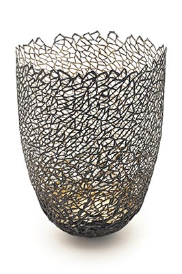
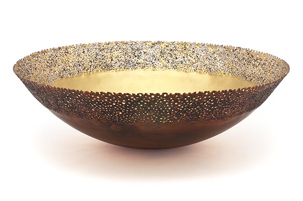
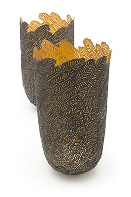
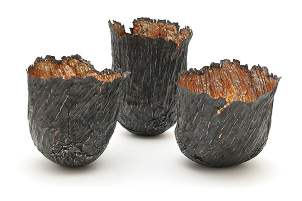
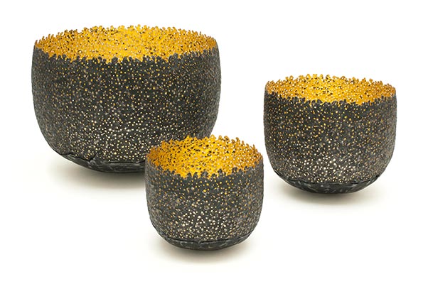
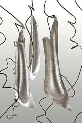
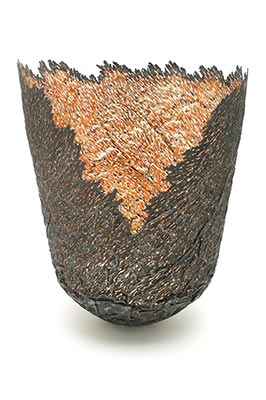
        Claire Malet produces work is inspired by natural forms and landscapes. Fragments of sea-worn shells, the rock formations of a battered coastline, a curl of split bark, the dancing light and shadow of woodland all give inspiration.

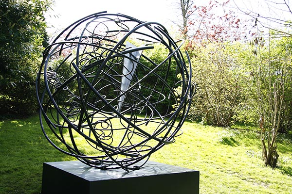
        I also draw inspiration directly from the characteristics of the medium. Working intuitively is key, allowing the metal to suggest a direction and find a relationship with the subject matter. I work in silver, copper, steel and ‘found metals’

        Claire Malet is exhibited internationally, with gallery representation in UK, USA, Australia and Ireland.

        I have pieces in several public collections, including the Victoria & Albert Museum and the National Museum Cardiff. Awards include Goldsmiths’ Fair Best New Design Award 2014.

        View Current Artworks

        Categories:

        • Sculpture
        • Installations
        • Accessories

        Sculpture Type:

        • Interior
        • Tabletop

        Mediums:

        • Sculpture – Metal-Cast
        • Sculpture Metal-Fabricated
        • Gilding

        Subject Matter:

        • Abstract
        • Natural Forms
        {"autoplay":"true","autoplay_speed":"3000","speed":"300","arrows":"true","dots":"true","rtl":"false"}

        My work is inspired by natural forms and landscapes: fragments of sea-worn shells, the rock formations of a battered coastline, a curl of split bark, the dancing light and shadow of woodland.

        Claire Malet

        Enquire about

          We will only use your personal information to send you information which you have requested from us. However, from time to time we may contact you with details of other services we provide. If you consent to us contacting you for this purpose please tick to confirm.

          I consent

          View our Privacy Policy for information on how we store, protect and manage your submitted data.

          Helen Lack

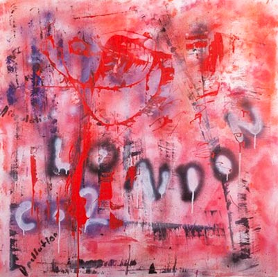
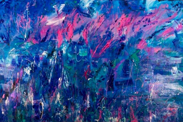
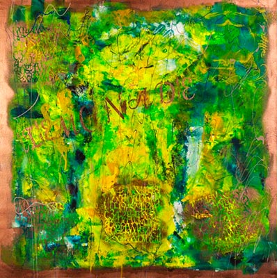
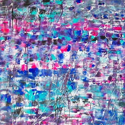
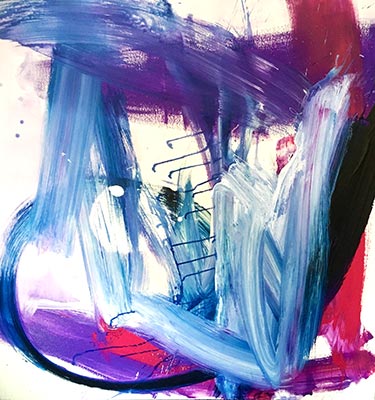
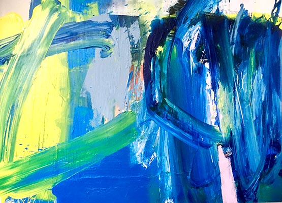
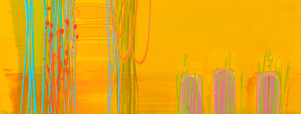
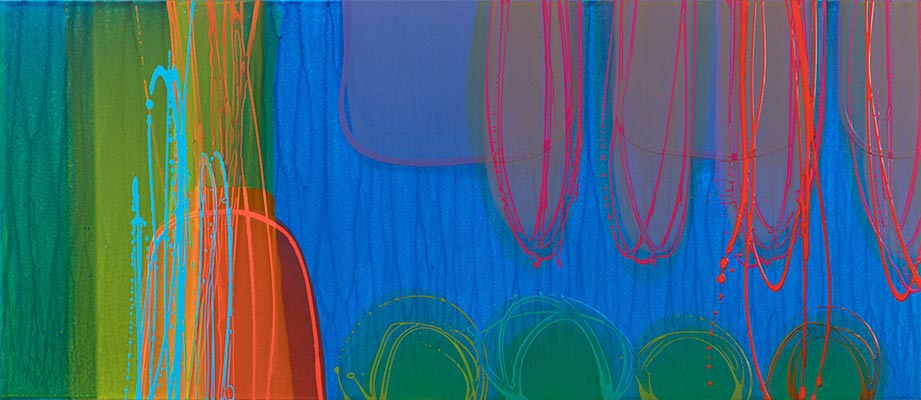
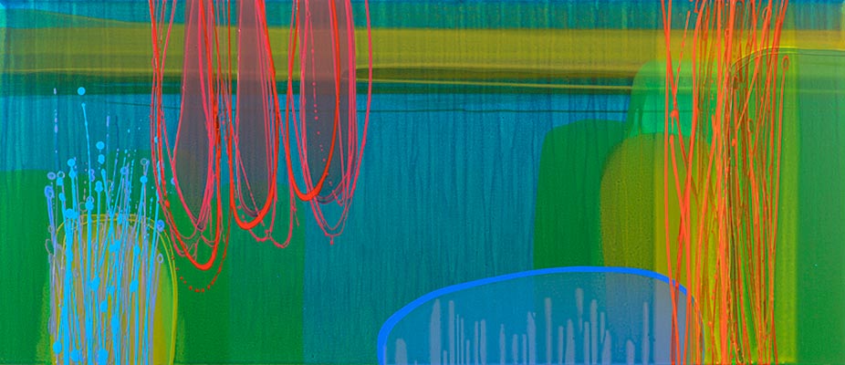
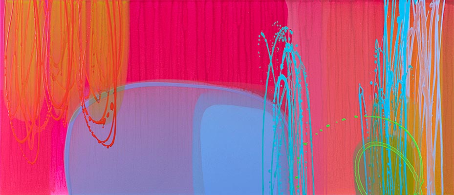
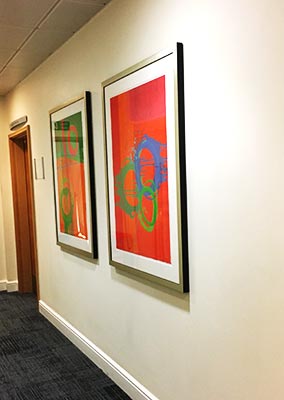
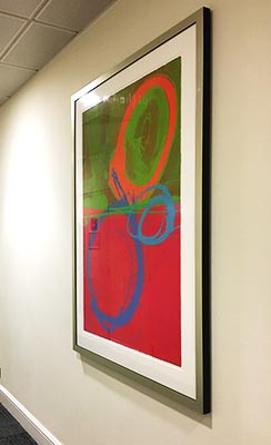
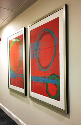
          Helen Lack is a contemporary artist working in the UK and producing large format and statement art. She has a unique style which is energetic, individual and vibrant with an urban edge.

          Her work has been described as having a richness of colours with a Pollock style, depicting the Abstract Expressionist movement. This has created a significant level of interest among galleries and collectors. As well as a healthy demand by companies requiring “office art”.

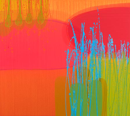
          Helen paints by combining many layers and thick brushstrokes using mixed media and drip techniques. She conveys emotion in all her works, which is received by the viewer as intriguing and involving.

          Her works are inspired by current events and environmental concerns. Her paintings showing passion and vibrancy as well as reflection and colour to her audience.

          Helen Lack has displayed her collections in contemporary shows, collaborated with other artists and curated her own solo exhibitions. All have attracted media interest in the UK and Europe and have received much acclaim.

          Her works have been exhibited in many prestigious galleries in London and New York, creating a truly international appeal. In addition, one prestigious gallery has asked for her works in Italy for very high-profile collectors.

          View Current Artworks

          Categories:

          • Paintings
          • Prints
          • Installations

          Mediums:

          • Collage
          • Mixed Media
          • Large Statement Paintings on Canvas, Panels and Paper
          • Prints – Artist and Other

          Subject Matter:

          • Abstract
          • Cityscape/Urban
          • Geographical
          • Interiors
          • Landscape
          • Portrait/Figurative
          • Seascape/Water
          {"autoplay":"true","autoplay_speed":"3000","speed":"300","arrows":"true","dots":"true","rtl":"false"}

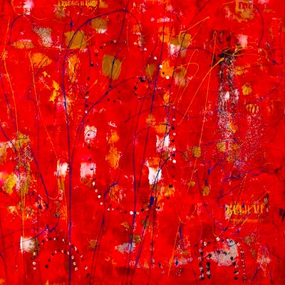
          My work has been described as having a richness of colours with a Pollock style, depicting the Abstract Expressionist movement.

          Helen Lack

          Enquire about

            We will only use your personal information to send you information which you have requested from us. However, from time to time we may contact you with details of other services we provide. If you consent to us contacting you for this purpose please tick to confirm.

            I consent

            View our Privacy Policy for information on how we store, protect and manage your submitted data.

            Deborah Lanyon

            Deborah Lanyon is based in Twickenham, London. She has been painting since the age of 15. In the late 1970’s Deborah trained at St Martin’s and the Byam Shaw School of Art.

            Throough the years she has exhibited extensively in London, the UK and Internationally. Including Art First in Cork Street and more recently at the Jenny Granger Gallery in Whitstable.

            Deborah’s work is collected by both private and corporate collectors including the Glass House Restaurant in Kew, the Square Restaurant in Bruton Street and in the Park Lane Hotel.

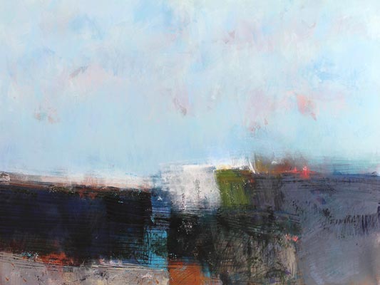
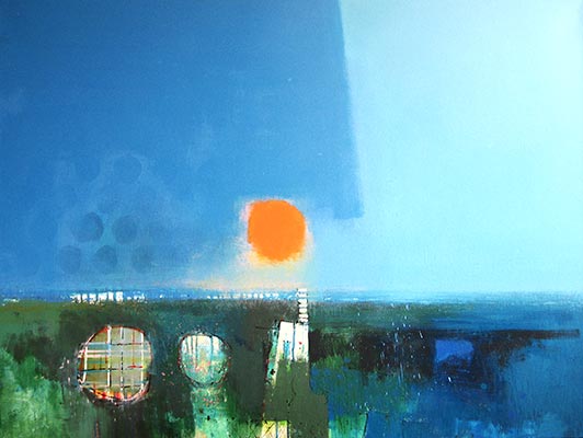
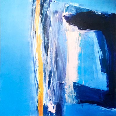
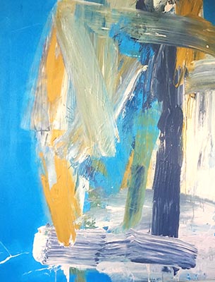
            Deborah Lanyon works primarily in acrylic producing large scale abstract landscapes. She likes to emphasise  both structure and colour in her compositions.

            She has been influenced by the St Ives artists such as Roger Hilton, Patrick Heron and Ben Nicholson. From Roger Hilton she learned the importance of mark making. From Patrick Heron about colour and from Ben Nicholson the significance of structure to hold the painting together.

            View Current Artworks

            Categories:

            • Paintings

            Mediums:

            • Painitngs on Canvas
            • Acrylic on Canvas

            Subject Matter:

            • Abstract
            • Landscape
            {"autoplay":"true","autoplay_speed":"3000","speed":"300","arrows":"true","dots":"true","rtl":"false"}

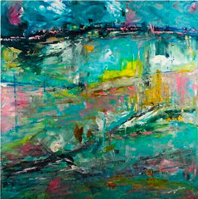
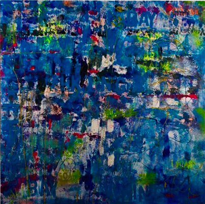
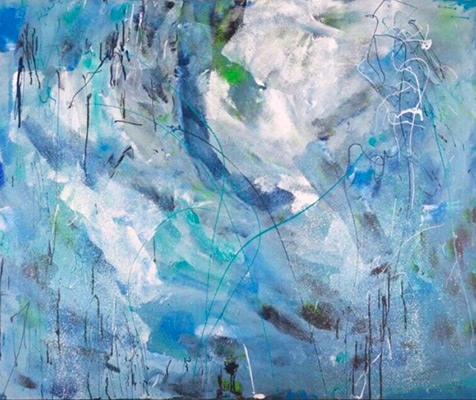
            My work is primarily in acrylic. I work on large scale abstract landscapes. I like to emphasise both structure and colour in my compositions.

            Deborah Lanyon

            Enquire about

              We will only use your personal information to send you information which you have requested from us. However, from time to time we may contact you with details of other services we provide. If you consent to us contacting you for this purpose please tick to confirm.

              I consent

              View our Privacy Policy for information on how we store, protect and manage your submitted data.

              Jonet Harley-Peters

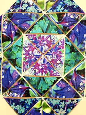
              Jonet Harley-Peters takes the natural world as her starting point. She interpret the effects of light on plants water and earth. As well as the shapes and shadows that float on the surface of fragile and changing nature.

              ‘I’ve always been drawn to symmetry and pattern and first started to explore geometry and proportion in my last year at Art school. Part of my childhood was spent in East Africa and the rest on the edge of Dartmoor. Africa gave me colour, pattern and red earth – while Dartmoor was full of mood, mist and water.’

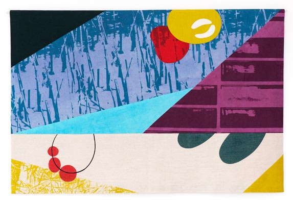
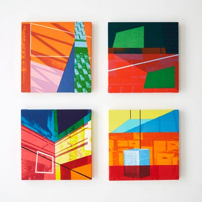
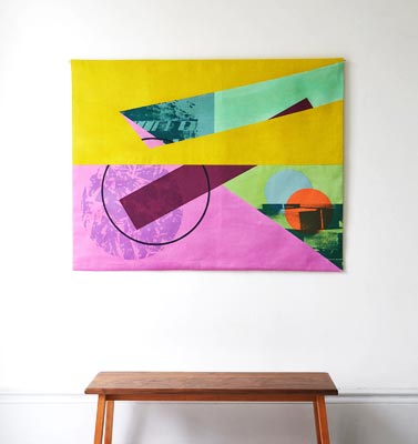
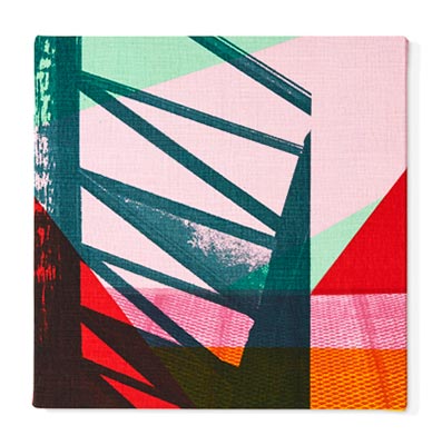
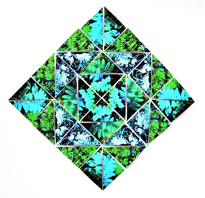
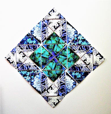
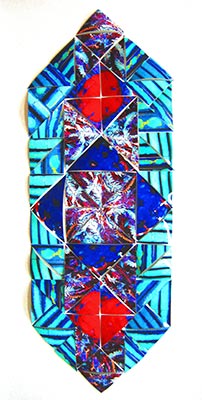
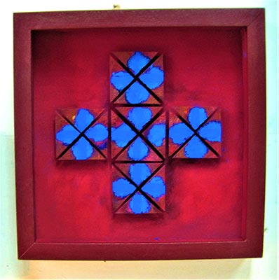
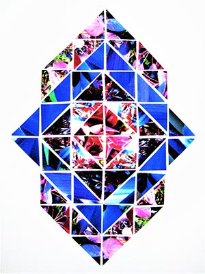
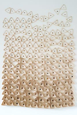
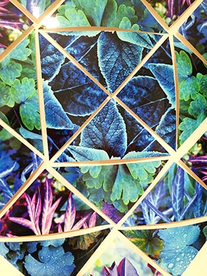
              Jonet works with basic geometry using raw pigments and photography to make low relief constructions and photo-montage. Her work is based on what I see in the natural world.

              ‘I take photographs and cut shapes to produce fragments and then take what I need to reconstruct to make a new ‘version’ and tell a new story. I am currently using triangles but my response varies due to the demands of the material.’

              Raw pigments have an intensity of colour and photo-montage shows the extraordinary detail and texture of the natural world. Simple geometric patterns provide a solid structure on which to base explorations with colour and image.

              Jonet Harley-Peters works mainly in low relief construction with curved and cut shapes backed with heavy weight paper and cardboard , when mounted the constructed shapes appear to float away from the surface. All the work is box framed .

              Categories:

              • Photography
              • Other

              Mediums:

              • Photography
              • Photo montage
              • Low Relief Construction

              Subject Matter:

              • Abstract
              • Animal/Botanical
              • Still Life
              {"autoplay":"true","autoplay_speed":"3000","speed":"300","arrows":"true","dots":"true","rtl":"false"}

              I take photographs and cut shapes to produce fragments and then take what I need to reconstruct to make a new 'version' and tell a new story.

              Jonet Harley-Peters

              Enquire about

                We will only use your personal information to send you information which you have requested from us. However, from time to time we may contact you with details of other services we provide. If you consent to us contacting you for this purpose please tick to confirm.

                I consent

                View our Privacy Policy for information on how we store, protect and manage your submitted data.

                Thurle Wright

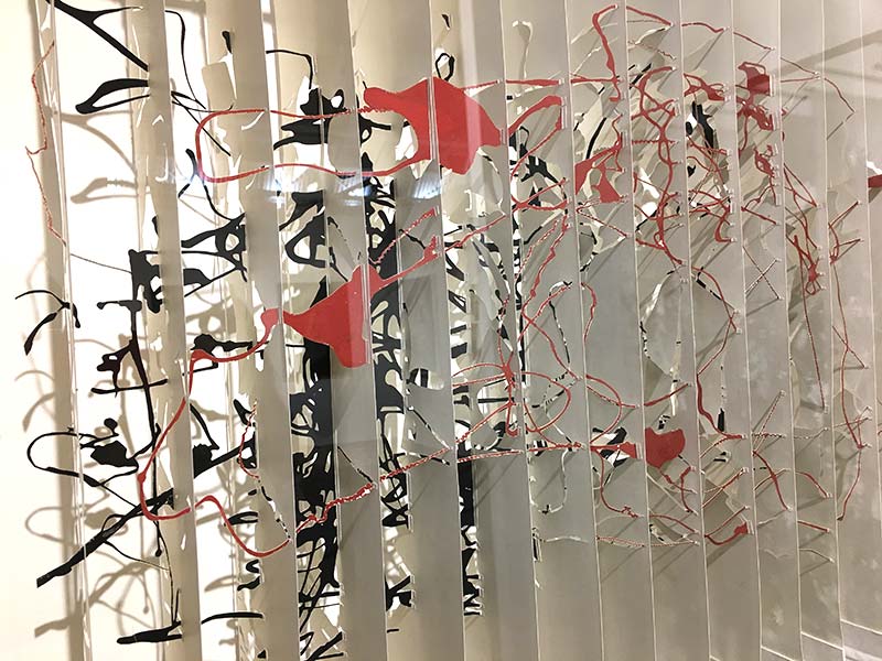
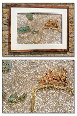
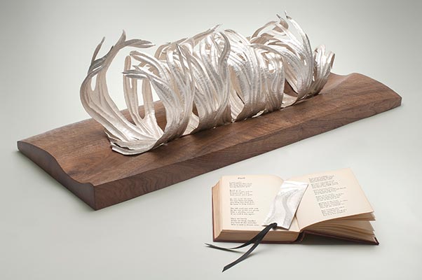
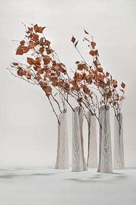
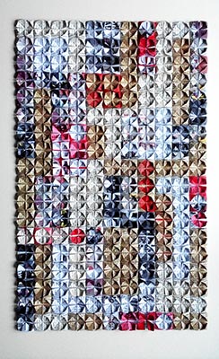
                Thurle Wright works with books, maps and words on paper.

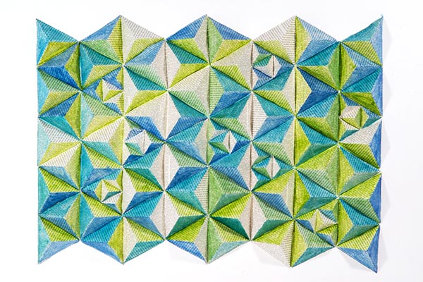
                Her delicate paper reconstructions stem from an interest in the systems and structures of language. As well as the ordering of knowledge and the collecting, storing and accessing of words.

                She cuts, folds, weaves and stitches lines of words into a new visual format. Traces of the original mingle with personal, often playful or poetic interpretations.

                Originally from Zimbabwe, Thurle works from her studio in Folkestone’s Creative Quarter.

                She has exhibited widely both in the UK and internationally, including Collect2019 at the Saatchi Gallery, the Bookarts Triennial in Lithuania, Deptford X, and Brussels Art on Paper.

                Numerous residencies include work for the V&A Museum of Childhood, Perth Central School of Art and Design, Camberwell Arts and various schools and colleges in the UK.

                Her work is held public and private collections including Brisbane State Library

                Categories:

                • Sculpture
                • Installations
                • Wall Panels

                Sculpture Type:

                • Interior

                Mediums:

                • Installation
                • Paper/Paper Pulp
                • Sculpture – Mixed Media
                • Sculpture – Mobile

                Subject Matter:

                • Abstract
                • Architectural
                • Geographical
                • Historical
                • Geometric
                • Patterned
                • Text-based
                {"autoplay":"true","autoplay_speed":"3000","speed":"300","arrows":"true","dots":"true","rtl":"false"}

                My delicate paper reconstructions stem from an interest in the systems and structures of language. As well as the ordering of knowledge and the collecting, storing and accessing of words.

                Thurle Wright

                Enquire about

                  We will only use your personal information to send you information which you have requested from us. However, from time to time we may contact you with details of other services we provide. If you consent to us contacting you for this purpose please tick to confirm.

                  I consent

                  View our Privacy Policy for information on how we store, protect and manage your submitted data.

                  34 Circus Road

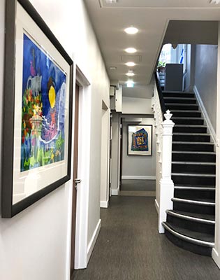
                  As part of an ongoing project at the HCA Wellington North Hospital, Art Contact was asked to select artworks for 34 Circus Road which has been recently refurbished as an Out Patient Centre.

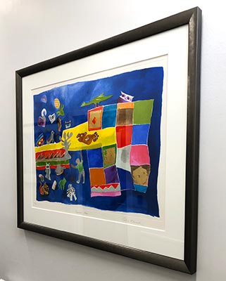
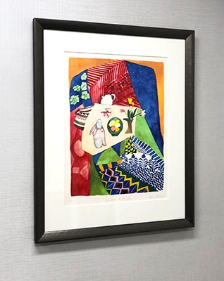
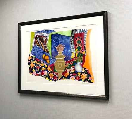
                  Bright and colourful Limited Edition prints by Angela Edwards were selected and they were framed in a Pewter moulding to full conservation standard.

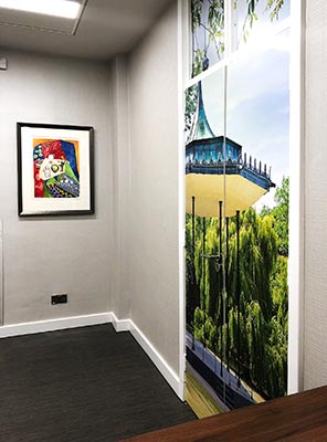
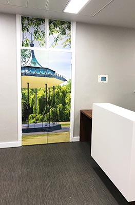
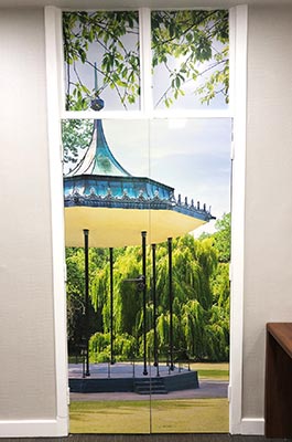
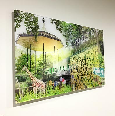
                  In the reception Art Contact commissioned a bespoke photographic collage applied directly to a pair of unsightly doors. The image is based on the Regents Park Bandstand being a local landmark.

                  • Object – Source and Supply artworks for 34 Circus Road
                  • Client – HCA
                  • Sector – Healthcare
                  • Location –  St Johns Wood, London
                  • Status – Completed
                  {"autoplay":"true","autoplay_speed":"3000","speed":"300","arrows":"true","dots":"true","rtl":"false"}

                  Wellington North Hospital Imaging Department

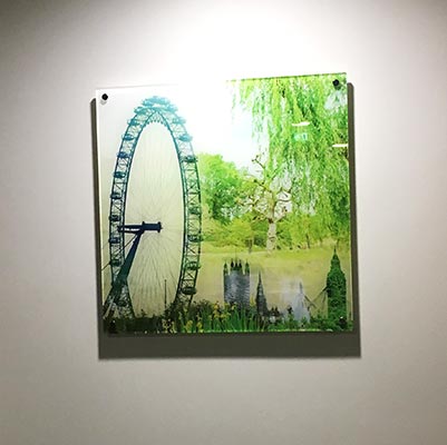
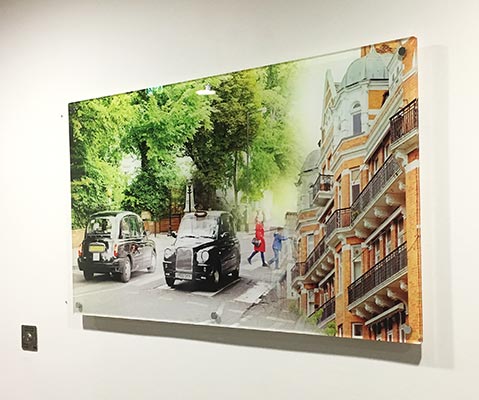
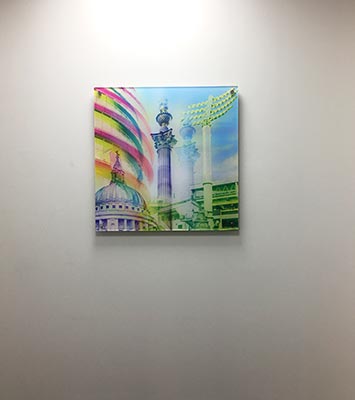
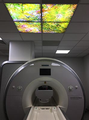
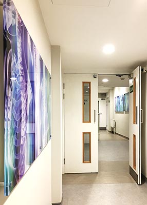
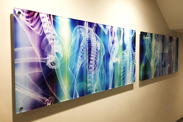
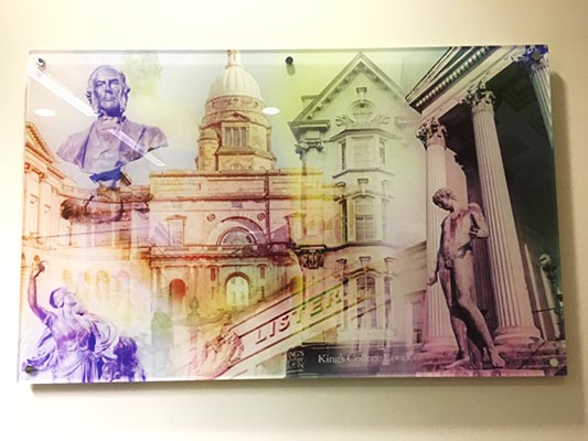
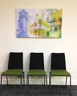
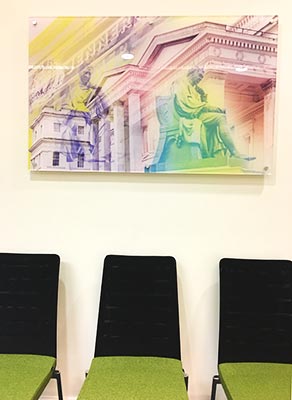
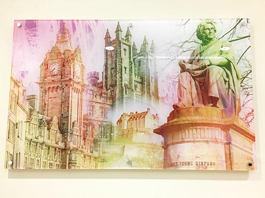
                  As part of the ongoing refurbishment project Art Contact was asked to supply artworks for the Wellington North Imaging Department on the first floor. Working with the project management team a series of bespoke images were commissioned to complement the theme of the department.

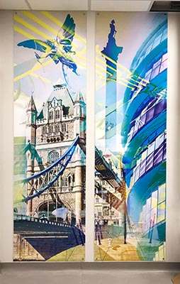
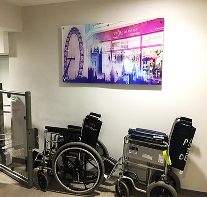
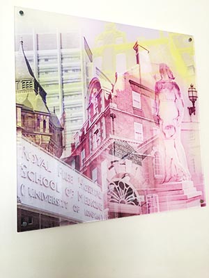
                  In keeping with the overall design the images were printed onto acrylic panels and installed using appropriate fixings to allow for the complex constraints of this department.

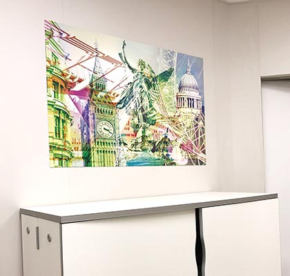
                  Bespoke photographic collages were commissioned by Art Contact as artworks for the Wellington North Imaging Department to both enhance the design and to create a link to the local community.

                  A photographer was commissioned by Art Contact to photograph local landmarks and to create a series of photographic collages to enhance the design of the department and to create a sense of place within the locality.

                  • Object – Source & Select Artworks for the Imaging Department
                  • Client – HCA Wellington North Hospital
                  • Sector – Healthcare
                  • Location – St John’s Wood, London
                  • Status – Completed
                  {"autoplay":"true","autoplay_speed":"3000","speed":"300","arrows":"true","dots":"true","rtl":"false"}

                  Dominic Pote

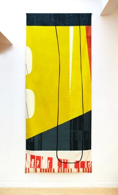
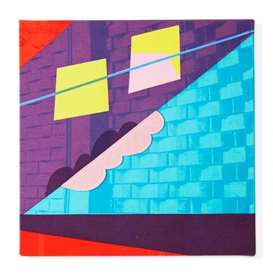
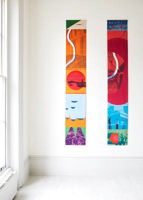
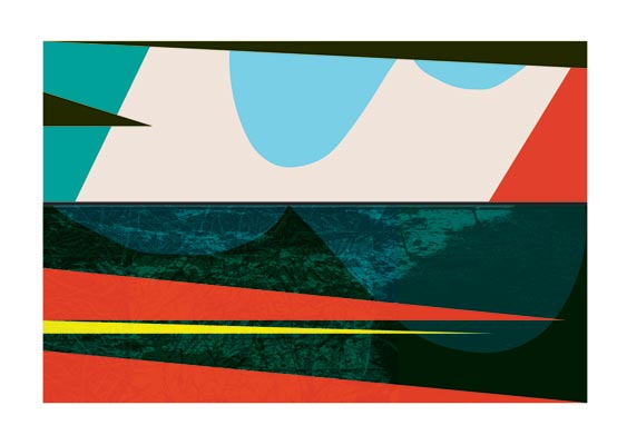
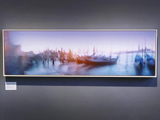
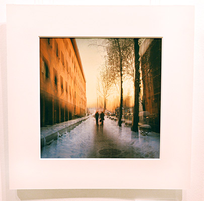
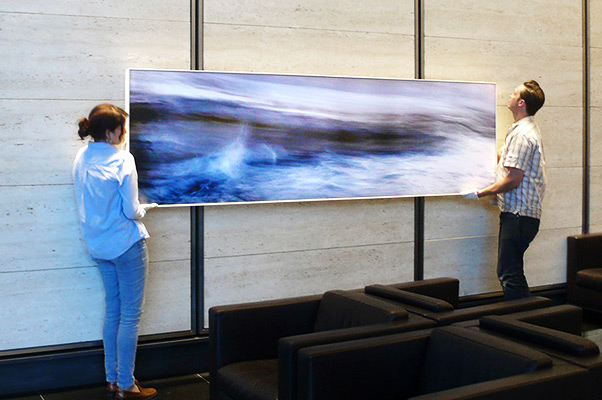
                  Dominic Pote is an artist working somewhere between the film maker and the still photographer. His exposures lasting as long as he keeps moving. Framed by the physical act of walking, his images are both literal and metaphorical journeys. Movements through space so that there remains something of the organic feel of their making. His work reveals the underlying spiritual significance of place. Whether an open landscape or the middle of a city, he presents us with the human experience. That which lies between movement and stillness, between the visible and invisible, between time and eternity.

                  Dominic Pote studied Photography at Nottingham Trent University from 1997 – 2000 where he attained a 1st class honours degree in Photography in Europe. During his second year his study was divided between two European institutes: Die Hochschule fur Grafik und Buchkunst – Leipzig, Germany and Famu School of film and photography, Prague, Czech Republic

                  Dominic’s large-scale works have been placed in many private homes as well as public and private collections. Commissioners of his work include Barclays Bank, The British Council and P&O.

                  Categories:

                  • Photography
                  • Wall Panels

                  Mediums:

                  • Photography
                  • Photography Printed on Panels

                  Subject Matter:

                  • Abstract
                  • Architectural
                  • Landscape
                  • Seascape/Water
                  • Cityscape/Urban
                  {"autoplay":"true","autoplay_speed":"3000","speed":"300","arrows":"true","dots":"true","rtl":"false"}

                  My work reveals the underlying spiritual significance of place. That which lies between movement and stillness, between the visible and invisible, between time and eternity.

                  Dominic Pote

                  Enquire about

                    We will only use your personal information to send you information which you have requested from us. However, from time to time we may contact you with details of other services we provide. If you consent to us contacting you for this purpose please tick to confirm.

                    I consent

                    View our Privacy Policy for information on how we store, protect and manage your submitted data.

                    Chris Wood

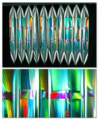
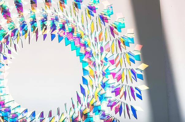
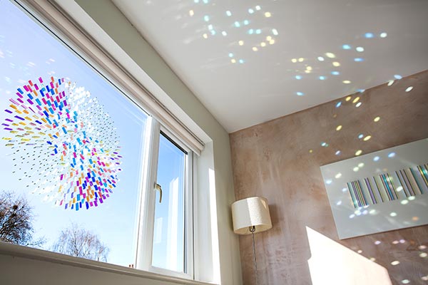
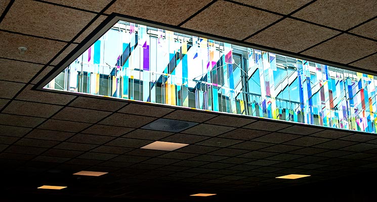
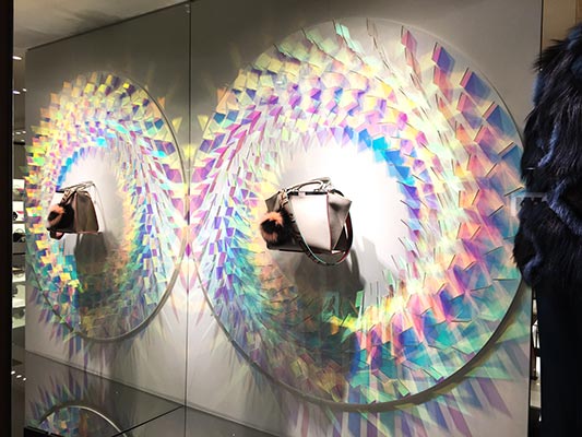
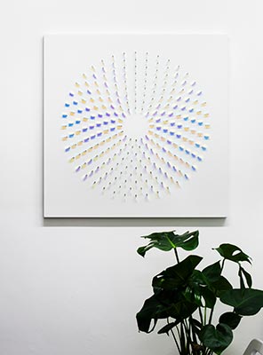
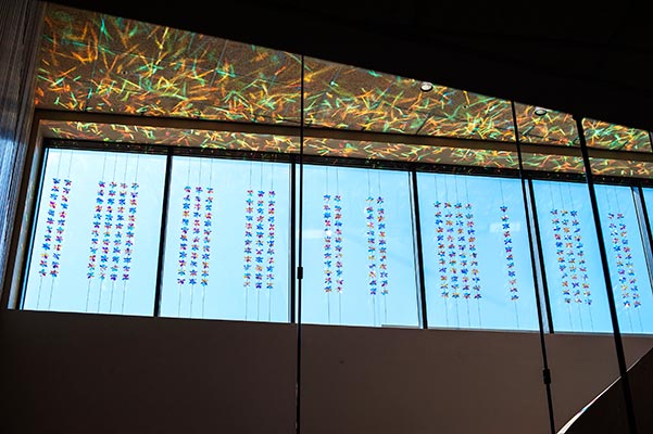
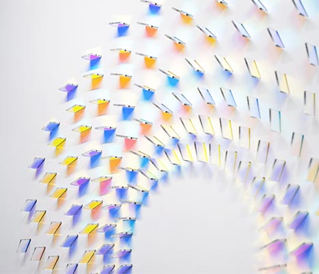
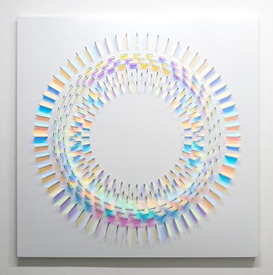
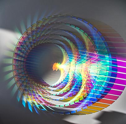
                    Chris Wood’s medium is light. She uses a range of high and low-tech optical materials to harness patterns of light that suggest ephemeral glimpsed moments in the natural world.

                    Her sculptures are simple arrangements creating kinetic patterns in response to the environments in which they are placed. Her work brings a wistful romanticism to a minimalist aesthetic. Chris Wood orders the accidental and makes us reflect on the experience of seeing.

                    After studying Furniture Design at Middlesex University in the mid 1980s. She then went on to study glass at the Royal College of Art, where she worked on architectural scale projects dealing with light and space.

                    Chris Wood produces innovative installations for gallery exhibition. She has shown extensively throughout the UK and internationally. Her work is represented in a number of private collections as well as the Shanghai Museum of Glass.

                    She also produces work to commission and has created works for Fendi Fashion House, Great Ormond Street Hospital, Premier Inn Hotel and a Scandinavian cruise ship. Chris is currently working on her largest project to date in Taiwan.

                    Categories:

                    • Sculpture
                    • Installations
                    • Wall Panels
                    • Glass

                    Sculpture Type:

                    • Exterior
                    • Interior

                    Glass Type:

                    • Dichroic Glass Wall Panels

                    Mediums:

                    • Installations
                    • Light
                    • Mixed Media
                    • Sculpture – Mixed Media
                    • Sculpture – Glass

                    Subject Matter:

                    • Abstract
                    {"autoplay":"true","autoplay_speed":"3000","speed":"300","arrows":"true","dots":"true","rtl":"false"}

                    My sculptures are simple arrangements creating kinetic patterns in response to the environments in which they are placed.

                    Chris Wood

                    Enquire about

                      We will only use your personal information to send you information which you have requested from us. However, from time to time we may contact you with details of other services we provide. If you consent to us contacting you for this purpose please tick to confirm.

                      I consent

                      View our Privacy Policy for information on how we store, protect and manage your submitted data.

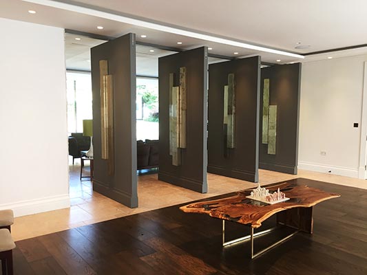
                      Claire Burke

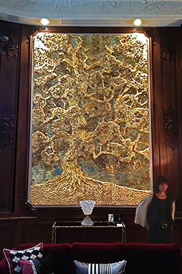
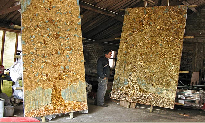
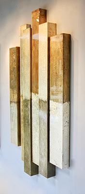
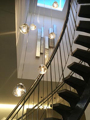
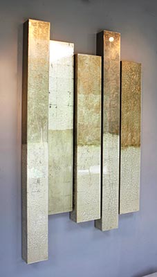
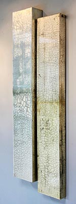
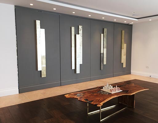
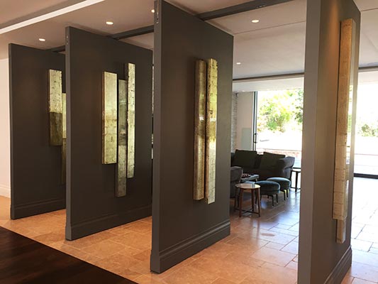
                      Claire Burke’s current work is the culmination of 20 years dedication to making beautiful abstract statements. Meditative, tranquil compositions playing with the picture plane with the suggestion of a horizon and landscape. Two textured surfaces juxtaposed, the subtle differences between them emphasised by their apparent simplicity, the work revealing itself to be deceptively detailed upon more prolonged examination. The work is fashioned from Gold and Silver Leaf. The timeless nature of the precious metals and the fascination they hold, adding to the works allure.

                      A truly international artist, Claire’s work has been sourced for clients both private and corporate. Examples include a gorgeous private ski chalet, The Four Seasons Royal Suite in Riyadh, the cruise ship Brittania, private yachts and of course many beautiful homes. Kleinwort Benson has acquired a significant work for their collection.

                      Claire graduated from Falmouth School of Art for her foundation, progressed immediately to Central St. Martins to complete her BA(Hons) Painting in 1994 and has never looked back.

                      Unusually by today’s standards, Claire’s degree show sold out and she was able to continue her career as soon as she graduated. Some of those early relationships with Galleries and Dealers still exist today.

                      Claire’s work has been exhibited on a global scale in Miami, New York, Switzerland, Singapore and Hong Kong. Claire continues to work with a broad network within the art sector, including interior designers, galleries and consultants.

                      Much of Claire’s work is now acquired by commission from her purpose built studio and her new works are in high demand.

                      Download Full Biography

                      Categories:

                      • Installations
                      • Wall Panels

                      Mediums:

                      • Gilded Panels
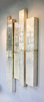
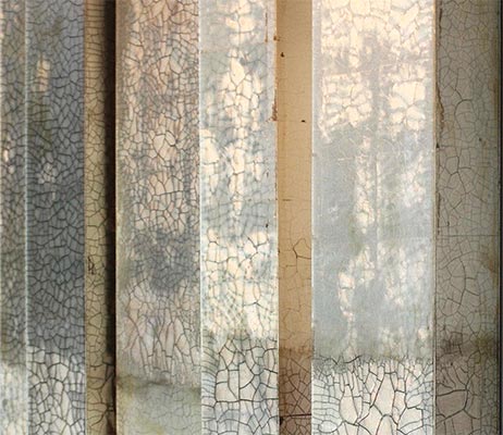
                      • Distressed Wall Panels

                      Subject Matter:

                      • Abstract
                      {"autoplay":"true","autoplay_speed":"3000","speed":"300","arrows":"true","dots":"true","rtl":"false"}

                      The work is fashioned from Gold and Silver Leaf. The timeless nature of the precious metals and the fascination they hold, adding to the works allure.

                      Claire Burke

                      Enquire about

                        We will only use your personal information to send you information which you have requested from us. However, from time to time we may contact you with details of other services we provide. If you consent to us contacting you for this purpose please tick to confirm.

                        I consent

                        View our Privacy Policy for information on how we store, protect and manage your submitted data.

                        Charlotte Cornish

                        Charlotte Cornish is a well established artist producing prints and paintings. The dominant theme of her work is the nature of human experience. Creating tensions and harmonies through the use of colour and form.

                        Much of the initial inspiration for Charlotte’s work comes from places she has visited and have significance to her. Often using photographs as a starting point, and as the compositions develop, combining elements taken from the photographs with imagery drawn from personal experience. Charlotte is fascinated by the possibilities of colour and colour relationships and the infinite potential they have to create dynamic connections and reactions.

                        Charlotte Cornish uses acrylic paint for her paintings as it dries relatively quickly. I like to build up numerous layers of poured paint in thin veils, which contrast with more thickly applied paint, creating a raised surface on the canvas. Waiting until the paintings are dry before applying each subsequent new mark allows her the opportunity to remove or modify painted areas, without affecting the preceding layers. I work with the canvases flat on the floor for much of the time. The paintings take at least eight weeks to complete.

                        View Current Artworks

                        Download Full Biography

                        Categories:

                        • Paintings
                        • Prints

                        Other Artwork Types:

                        • Monotype Printing Techniques with Acrylic on Paper

                        Mediums:

                        • Paintings on Canvas
                        • Prints – Artist-Screen Prints
                        • Prints – Artist-Mono-prints

                        Subject Matter:

                        • Abstract
                        {"autoplay":"true","autoplay_speed":"3000","speed":"300","arrows":"true","dots":"true","rtl":"false"}

                        Much of the initial inspiration for my work comes from places I have visited and have significance to me.

                        Charlotte Cornish

                        Enquire about

                          We will only use your personal information to send you information which you have requested from us. However, from time to time we may contact you with details of other services we provide. If you consent to us contacting you for this purpose please tick to confirm.

                          I consent

                          View our Privacy Policy for information on how we store, protect and manage your submitted data.

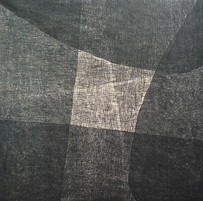
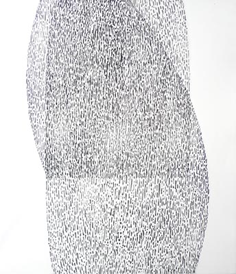
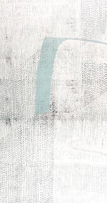
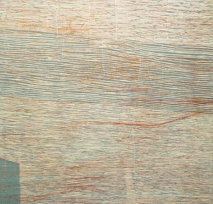
                          Jo Gorner

                          University, Jo was taught printmaking by Jean Lodge, who studied with S W Hayter at Atelier 17, Paris and who was inspirational in her rigorous approach and experimentation. Jo went on to complete an MA in print at Manchester Metropolitan University.

                          Printmaking is central to Jo’s practice, though it does not dominate the narrative or dictate the expression. The relief and etching techniques Jo Gorner uses allow space and time to consider an image facilitating the passage from thought to paper.

                          The quality of the marks Jo achieves, the presence of the hand and incidence of chance, are all integral to her work.

                          The restorative value of the creative process and the impact of the natural landscape both underpin Jo’s practice. The artwork which results is a sensory, embodied, response to this immersion in the natural environment and her relational encounter with a landscape.

                          View Current Artworks

                          Download Full Biography

                          Categories:

                          • Prints

                          Mediums:

                          • Prints – Artist
                          • Etchings

                          Subject Matter:

                          • Abstract
                          • Geographical
                          {"autoplay":"true","autoplay_speed":"3000","speed":"300","arrows":"true","dots":"true","rtl":"false"}

                          The restorative value of the creative process and the impact of the natural landscape both underpin my practice.

                          Jo Gorner

                          Enquire about

                            We will only use your personal information to send you information which you have requested from us. However, from time to time we may contact you with details of other services we provide. If you consent to us contacting you for this purpose please tick to confirm.

                            I consent

                            View our Privacy Policy for information on how we store, protect and manage your submitted data.

                            Mark Beattie MRSS

                            Mark Beattie MRSS is a British award winning sculptor who lives and works in London.

                            In 2015, Mark won the Midlands Open, The Xerxes Sculpture Prize and was elected a Member of The Royal Society of Sculptors (MRSS). In 2017 Mark was shortlisted for the Open Contemporary Young Artist Award run by the Biscuit Factory Gallery in Newcastle and long-listed for The Secret Art Prize by Curious Duke Gallery and also for the international Rise Art Prize.

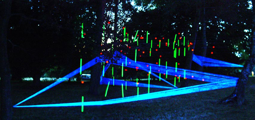
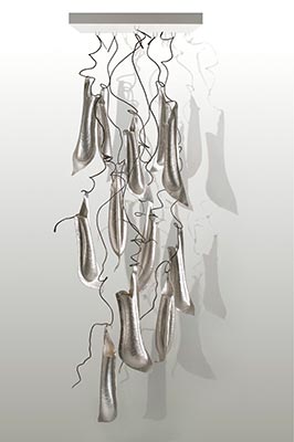
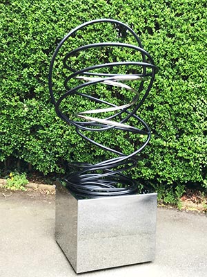
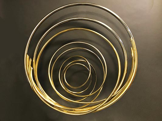
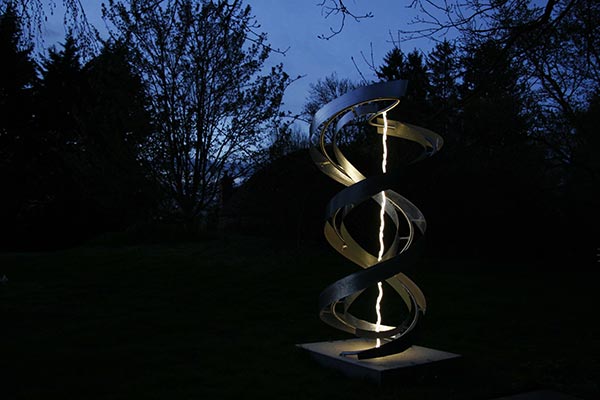
                            Working with various metals in all their contrasting properties of texture and finish, Mark can make industrial materials appear fluid, malleable and delicate. He continues to study different metals, looking at ways to manipulate and add movement to the material.

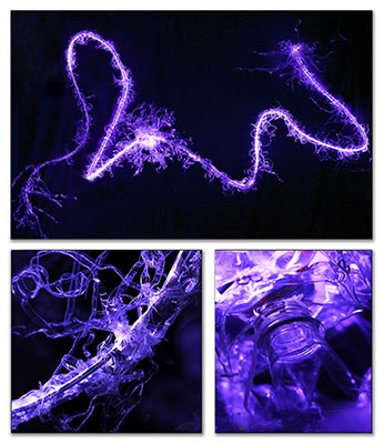
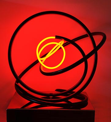
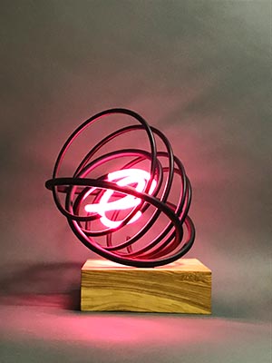
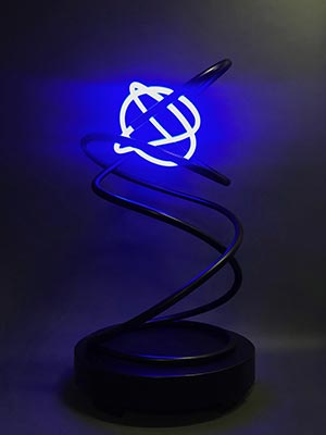
                            Over the past 3 years Mark has been developing ways in which neon and LED’s can complement his sculptures, adding to the movement of a piece and catching the viewer’s eye.

                            Mark has a strong academic background in art, having studied a BA Hons (International) in Contemporary Art Practice at Leeds University, with a period at the Australian National University at Canberra, and after an MA in European Arts Practice at Kingston University, Surrey. To date he has now exhibited in over 60 exhibitions, solo and group and has a strong following from collectors both in the UK and abroad.

                            View Current Artworks

                            Download Full Biography

                            Categories:

                            • Sculpture
                            • Wall Panels

                            Sculpture Type:

                            • Exterior
                            • Interior
                            • Tabletop

                            Mediums:

                            • Sculpture – Metal-Fabricated
                            • Sculpture – Mixed Media
                            • Sculpture – Light

                            Subject Matter:

                            • Abstract
                            {"autoplay":"true","autoplay_speed":"3000","speed":"300","arrows":"true","dots":"true","rtl":"false"}

                            I strive to make industrial materials appear fluid, malleable and delicate and continue to study different metals, looking at ways to manipulate and add movement to the material.

                            Mark Beattie

                            Enquire about

                              We will only use your personal information to send you information which you have requested from us. However, from time to time we may contact you with details of other services we provide. If you consent to us contacting you for this purpose please tick to confirm.

                              I consent

                              View our Privacy Policy for information on how we store, protect and manage your submitted data.

                              Wellington South Doctors Lounge

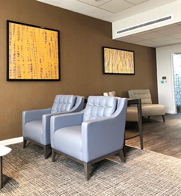
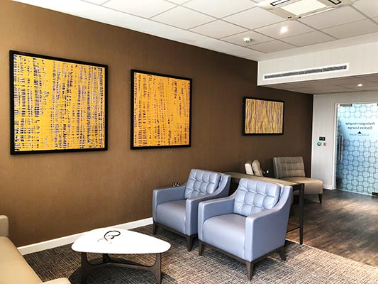
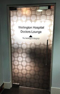
                              As part of an ongoing project Art Contact was asked to supply artworks for the new Doctor’s Lounge at the Wellington South Hospital.

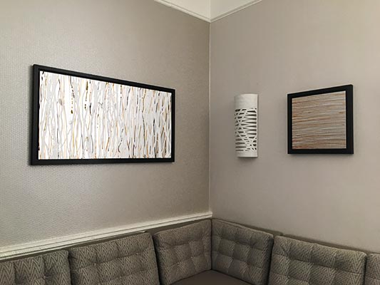
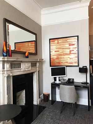
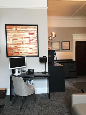
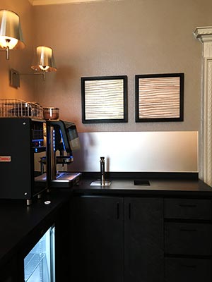
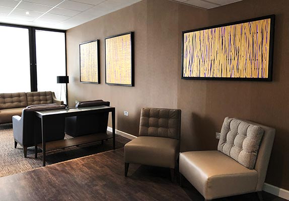
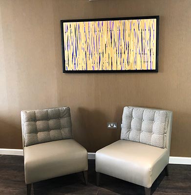
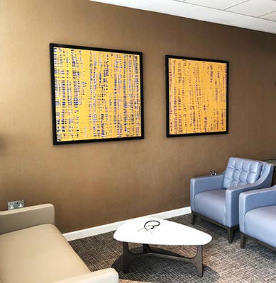
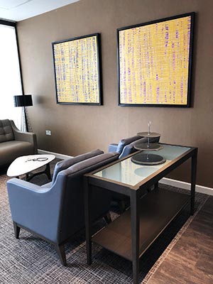
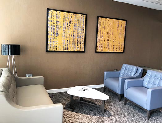
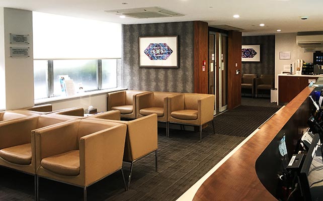
                              Julia Brooker was commissioned to produce a number of her abstract paintings on aluminium panels. She has used a colour palate to complement the interior of the Lounge. The paintings were then framed in ‘Wenge’ coloured tray frames.

                              During the installation a number of doctors came to have a look at the new Doctors Lounge. They were all impressed by the lounge and particularly the artworks.

                              The creation of Doctor’s Lounges by the HCA Group of Hospitals has been extremely well received by the staff.

                              • Object – Source, select & supply artworks for the Doctor’s Lounge
                              • Client – Wellington South Hospital
                              • Sector – Healthcare
                              • Location –  London
                              • Status – Completed
                              {"autoplay":"true","autoplay_speed":"3000","speed":"300","arrows":"true","dots":"true","rtl":"false"}

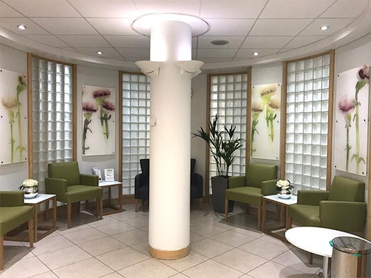
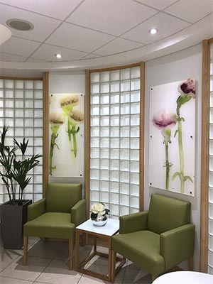
                              Devonshire House Orthopaedic Clinic

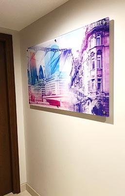
                              Working with the refurbishment team Art Contact assists with sourcing and supplying appropriate artwork for Devonshire House Orthopaedic Clinic.

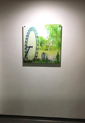
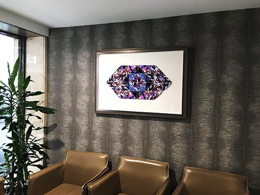
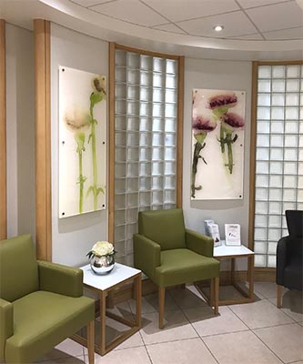
                              As part of an on-going art programme which has developed over the years a photographer was engaged to create a series of photographic collage images both of the local area and other appropriate imagery. These were then printed onto perspex and installed on stand-off bolts.

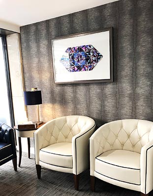
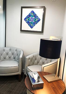
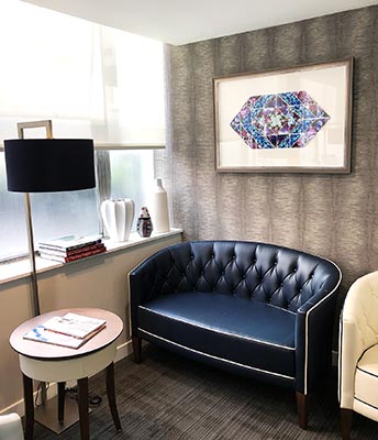
                              In the main reception the client was keen to draw from nature. An artist was selected to create patterns using photographs of plants which were then box framed to full conservation standards.

                              The colour pallet used in the commissioned artwork was chosen to enhance the Devonshire House Colour concept.

                              • Object – Source & Select artwork for Orthopaedic Clinic
                              • Client – HCA – Devonshire House Orthopaedic Clinic
                              • Sector – Healthcare
                              • Location – Marylebone, London
                              • Status – Completed
                              {"autoplay":"true","autoplay_speed":"3000","speed":"300","arrows":"true","dots":"true","rtl":"false"}

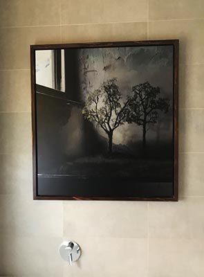
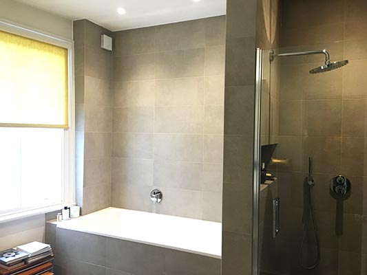
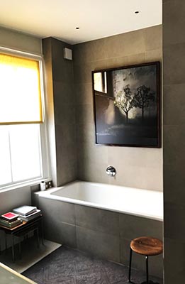
                              Private Client – Bathroom Picture

                              We were approached by our client to supply a bathroom picture for her Chelsea home. See our Purchasing Services.

                              Bathrooms have always caused significant problems for displaying artworks and above a bath is the most difficult. The steam rising from the bath causes particular issues with moisture.

                              A photograph was chosen which was printed directly onto Di-bond to mitigate the moisture issues.

                              The image chosen for the bathroom picture was ideal for this. By printing directly onto the di-bond some of the metallic surface was allowed to show through which work particularly well with this image.

                              The printed panel was then floated into a simple wooden tray frame stained to echo other items in the room.

                              • Object – Supply Artwork for Bathroom
                              • Client – Private Client
                              • Sector – Residential
                              • Location –  Chelsea, London
                              • Status – Completed
                              {"autoplay":"true","autoplay_speed":"3000","speed":"300","arrows":"true","dots":"true","rtl":"false"}

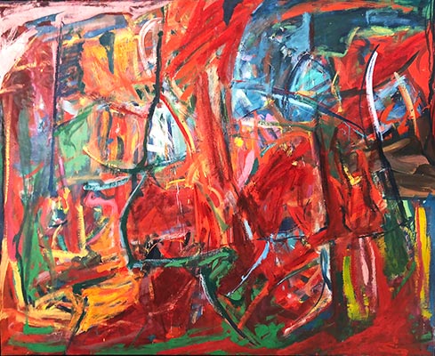
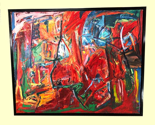
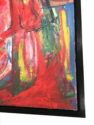
                              Private Client – Sanchez Restoration

                              Painting restoration required to painting damaged by the rolling up of the painting that had been removed from its stretcher.

                              This artwork had been purchased by our client. For easy transportation and the painting had been removed from the stretcher and rolled up. This had resulted in extensive cracking and significant losses due to the rolling of the canvas and the lack of tension.

                              Art Contact was asked to arrange the restoration of the damaged painting and to supply a new stretcher and tray frame.

                              The painting was carefully packed for transportation, fixed to a new stretcher and re-touched. Once completed the painting was fixed into its new tray frame and the artwork returned to our client.

                              The painting was then installed by the client.

                              Our Conservation and Restoration Services

                              • Object – Restoration of Damaged Painting
                              • Client – Private Client
                              • Sector – Residential
                              • Location –  Mayfair, London
                              • Status – Completed
                              {"autoplay":"true","autoplay_speed":"3000","speed":"300","arrows":"true","dots":"true","rtl":"false"}

                              Kings Fund – Painting Restoration

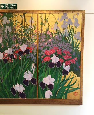
                              Painting Restoration required by the Kings Fund for minor damage to a triptych by Gerald Mynott. The painting had a number of scratches in the surface and the frame had some damage to the gilding and the gesso preparation. This damage had been caused by daily traffic through the offices – tea trolleys etc.

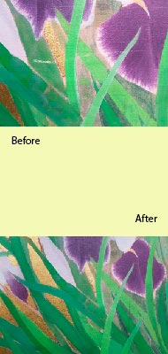
                              The scratches in the paint surface were retouched with a reversible treatment of pigments in an acrylic resin binder.

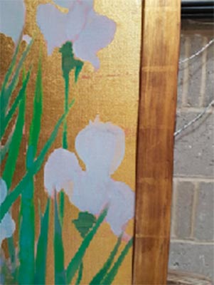
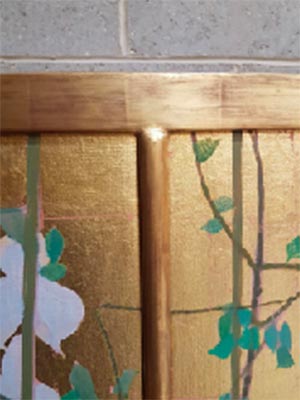
                              The damage to the frame was repaired using traditional materials and 23.5crt gold leaf. Once completed the surface was distressed and toned with pigments in an organic binder to match the original surface.

                              Once the painting restoration had been completed it was returned to the Kings Fund and re-installed.

                              Click here for further information about Conservation and Restoration

                              • Object – Restoration of Damaged Painting and Frame
                              • Client – Kings Fund
                              • Sector – Institution
                              • Location –  London
                              • Status – Completed
                              {"autoplay":"true","autoplay_speed":"3000","speed":"300","arrows":"true","dots":"true","rtl":"false"}

                              Royal Marsden – Sutton

                              The Royal Marsden Hospital in Sutton approached Art Contact to supply artworks for the Robert Tiffany wing. The recently refurbished Robert Tiffany wing required Art in all key areas.

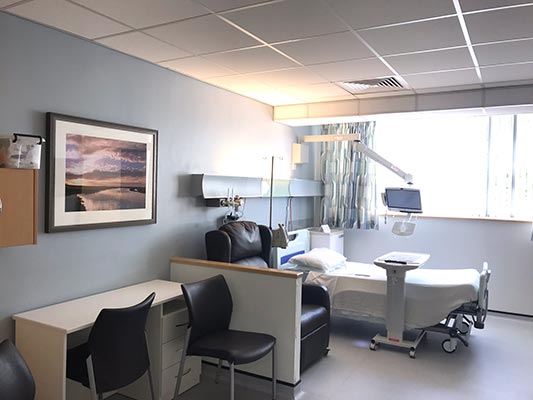
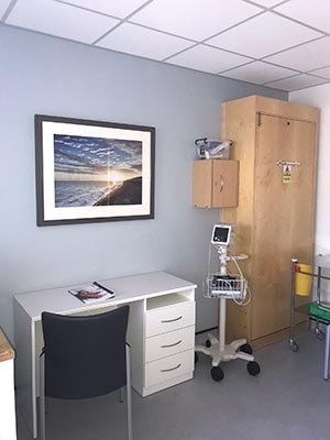
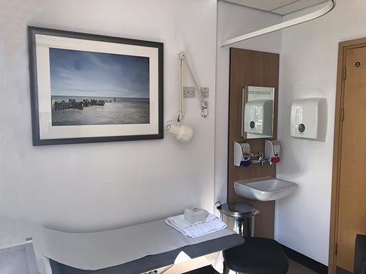
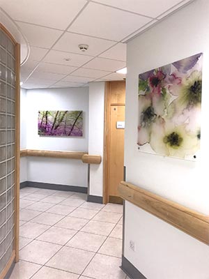
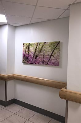
                              Virginia Grub worked closely with the staff of the Royal Marsden – Sutton to choose a suitable theme for each area. Floral and Woodland themes were chosen for the corridor and the reception area. For the patient rooms a coastal theme was chosen.

                              The pictures in the corridor and the reception area were reverse printed onto the Perspex panels. Which were then fixed to the walls using Panel fixings.

                              In the patient rooms the pictures were framed in a moulding to suit the interior palette.

                              Our Services for Healthcare

                              Download Case Study

                              • Object – Source and Supply artworks for Robert Tiffany Ward
                              • Client – Royal Marsden NHS, Sutton
                              • Sector – Healthcare
                              • Location –  Sutton, Greater London
                              • Status – Completed
                              {"autoplay":"true","autoplay_speed":"3000","speed":"300","arrows":"true","dots":"true","rtl":"false"}

                              Talbot Hughes McKillop

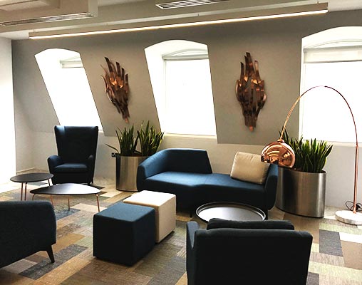
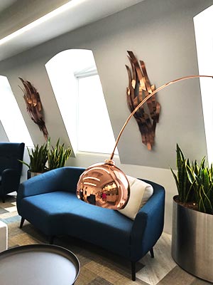
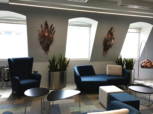
                              The brief from our client was to source a few tactile artworks which would be a talking point. This we certainly have achieved.

                              There were few tricky areas to over come, the slopping wall in the main reception area and the acoustic panels in several of the internal rooms.

                              For the sloping walls in the Reception, a copper wall sculpture by Philip Melling was chosen to compliment the colour pallet used in the reception. Outside the boardroom a paper piece by an Italian artist framed in a perspex box gave the piece a jewel like quality.

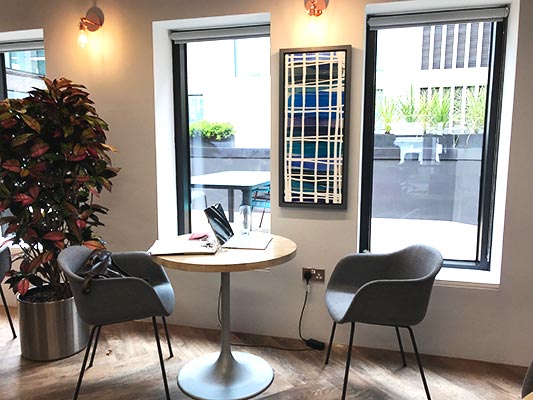
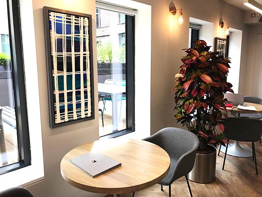
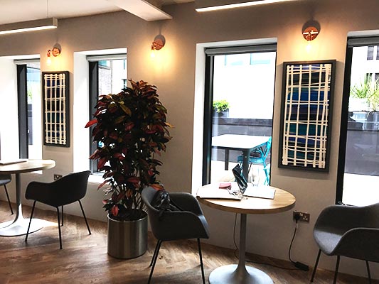
                              In the break-out area, painted aluminium sheets by Julia Brooker were selected. These were framed in box frames to fit on the narrow walls between the windows.

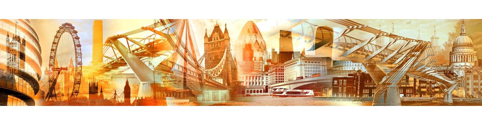
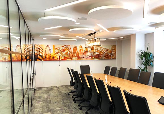
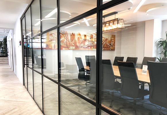
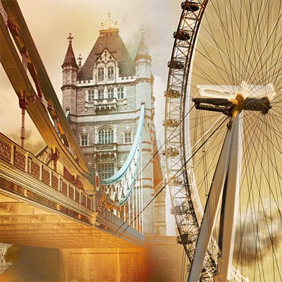
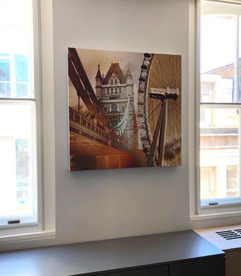
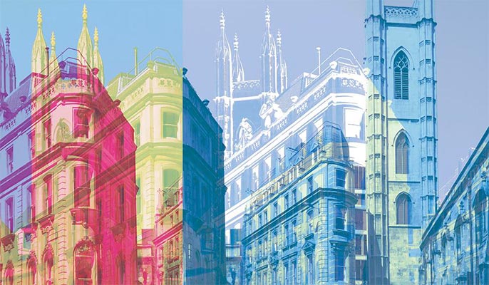
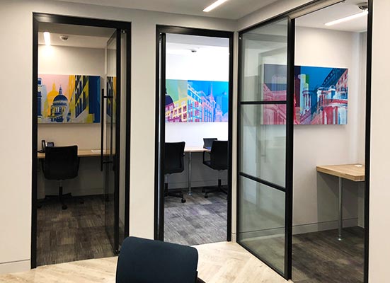
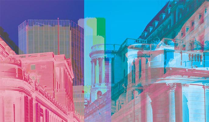
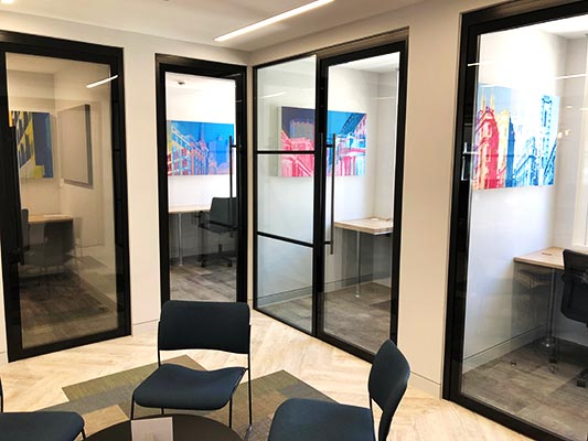
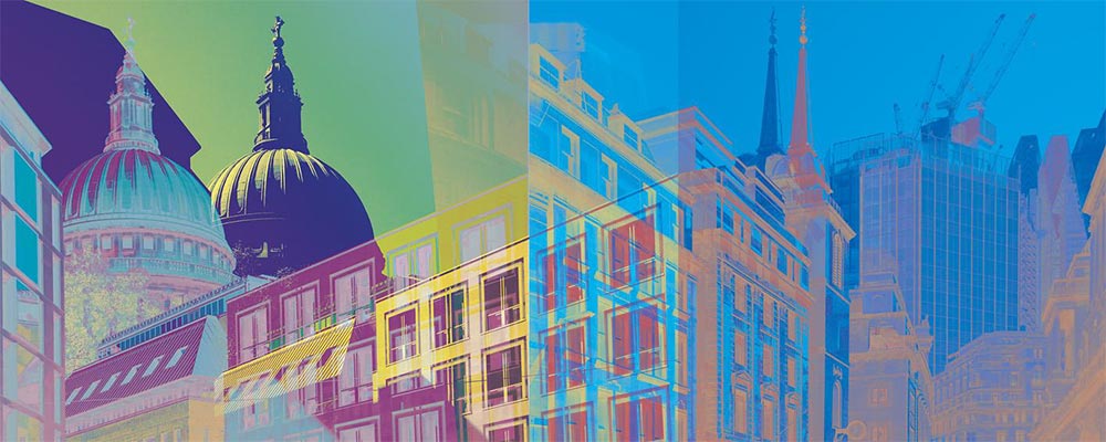
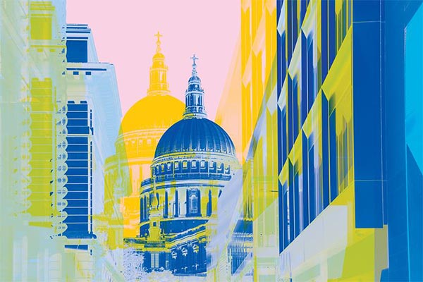
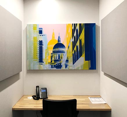
                              The Boardroom, Pavilion Meeting Room and Booths have acoustic panels giving limited space for artwork. To get round this we commissioned a digital artist to photograph the local area and produce image montages of local and iconic buildings which were then printed onto the fabric cover of the acoustic panels.

                              Download Case Study

                              • Object – Review of art collection for London offices
                              • Client – Talbot Hughes McKillop – Recommended by Hugh Prisick of Storey Project Management Consultancy
                              • Sector – Offices and Corporate
                              • Location –  London
                              • Status – Completed
                              {"autoplay":"true","autoplay_speed":"3000","speed":"300","arrows":"true","dots":"true","rtl":"false"}

                              BMA – Conference and Meeting Rooms

                              Art Contact was asked to find appropriate artwork to be included in the refurbishment of various meeting and conference rooms.

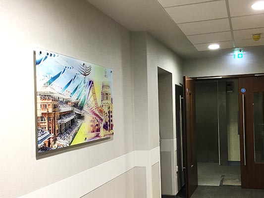
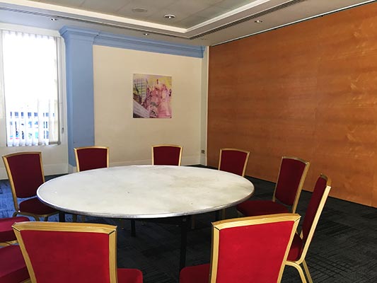
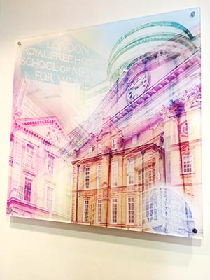
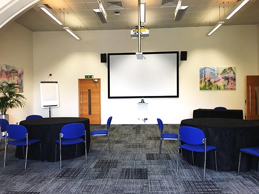
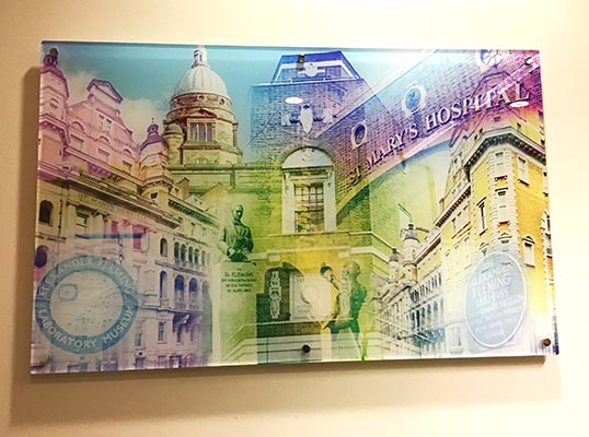
                              To meet the brief a series of photographic montages were commissioned printed onto acrylic panels. In the circulation spaces montages were created of the BMA and the surrounding area but in the named meeting rooms very specific themes were chosen relating to the name of the meeting room.

                              As well as these commissions, there were also a number of pictures that required re-framing to match the new colour scheme and the interior design of the refurbishment.

                              To further enhance the interior design clocks and other accessories were also supplied.

                              Download Case Study

                              • Object – Commission acrylic panels for Conference and Meeting Rooms
                              • Client – BMA
                              • Sector – Institution
                              • Location –  London
                              • Status – Completed
                              {"autoplay":"true","autoplay_speed":"3000","speed":"300","arrows":"true","dots":"true","rtl":"false"}

                              Mace Community Art Project

                              Mace Community Art Project

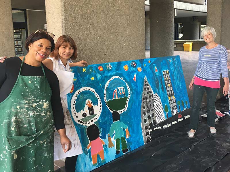
                              Art Contact was engaged to arrange a community art programme for the Mace construction site at 21 Moorfields.

                              Art Contact was engaged to arrange a community art programme for the Mace construction site at 21 Moorfields.

                              Harley Street Hospital

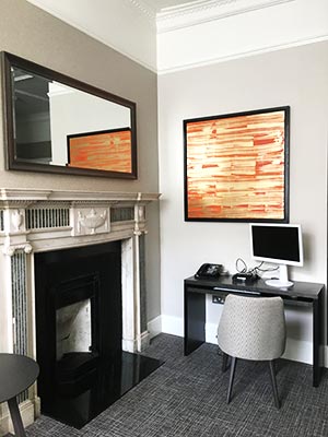
                              As part of an ongoing project Art Contact was asked to supply artworks and accessories for the new Doctor’s Lounge at the Harley Street Hospital.

                              Julia Brooker was commissioned to produce a number of her abstract paintings on metal using a colour palate to match the interior of the Lounge. These paintings were then framed in a Wenge tray frames.

                              As well as the paintings we also supplied a mirror, soft furnishings and other accessories to help create a suitable atmosphere for this lounge.

                              Download Case Study

                              • Object – Source, select & supply art and accessories for the Doctor’s Lounge
                              • Client – Harley Street Hospital
                              • Sector – Healthcare
                              • Location –  London
                              • Status – Completed
                              {"autoplay":"true","autoplay_speed":"3000","speed":"300","arrows":"true","dots":"true","rtl":"false"}

                              Waverton Investment Management Ltd

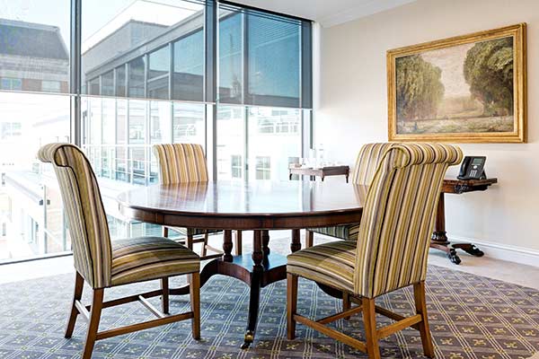
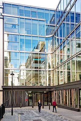
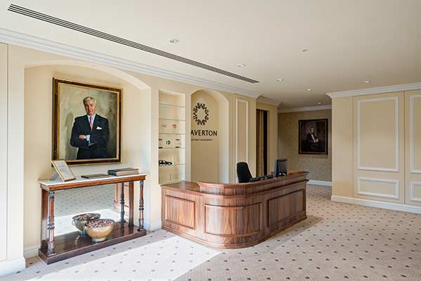
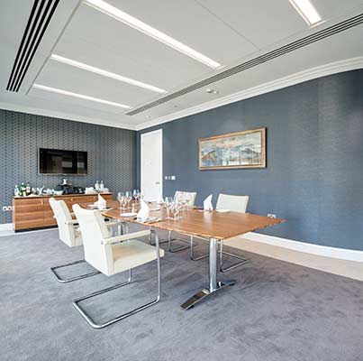
                              Working in conjunction with Denton Associates, Art Contact was asked to oversee and manage the relocation programme for Waverton’s artworks to their new offices.

                              Our brief included; the review of existing framing, assessment of any restoration/conservation requirements to the artwork, packing and moving of artwork to their new site and the installation of the artwork.

                              In advance of the move Art Contact pre-arranged the artwork layout for their new offices, which was presented to the client for approval.

                              Art Contact over saw and managed the packing and labeling of the artwork, prior to moving the existing artwork to the new site and installing them as arranged. Most of the artworks were re-framed in house, to suit the decor in their new offices.

                              Download Case Study

                              • Object – Review and relocation of art collection for London offices
                              • Client – Waverton Investment Management Ltd through Denton Associates
                              • Sector – Offices and Corporate
                              • Location –  London
                              • Status – Completed
                              {"autoplay":"true","autoplay_speed":"3000","speed":"300","arrows":"true","dots":"true","rtl":"false"}

                              Virginia provides Denton with a first class artwork consultancy service. She deals direct with all our clients, eliminating any added margin and advises on the strategy, sourcing and supply of all types of art. Given the diversified nature of these clients and their requirements, this is no mean feat! She has restored and valued existing portfolios and delivered some really innovative and creative ideas in all nature of products, to suit the modern and contemporary workplace, as well as within listed buildings. She is a true expert and makes it a thoroughly enjoyable process.

                              James Lang, Director, Denton Associates

                              London Art Fair – 30th Anniversary Show

                              London Art Fair – 30th Anniversary Show

                              The London Art Fair returned to the business design centre in Islington from 17-21st January.

                              The London Art Fair returned to the business design centre in Islington from 17-21st January.

                              Corporate Client – Relocation to Nova South

                              Our client, one of the largest private equity investors, with offices globally. Art Contact was commissioned to review, refresh and supplement their existing art collection to suit their new offices at Nova South, Victoria.
                              To assist with the move Art Contact audited the collection and produced a detailed plan for each artwork. Where necessary artworks were re-framed to suit the new offices.

                              In addition Art Contact was invited to source and select new site specific artworks to complement both the existing collection and also their corporate identity. The resulting purchases and commissions were managed from design through to installation and at the appropriate time the collection was delivered and installed in their new offices.

                              • Object – To review, refresh and supplement the existing art collection and co-ordinate the relocation to Nova South
                              • Client – Corporate Client
                              • Sector – Corporate
                              • Location – Victoria, Central London
                              • Status – Completed
                              {"autoplay":"true","autoplay_speed":"3000","speed":"300","arrows":"true","dots":"true","rtl":"false"}